Sidebar
Data is Beautiful

cross-posted from: https://qoto.org/users/mapto/statuses/113147786737843592 > Friends don't let friends... > > Quite good list of good practices for basic graph charting > [https://github.com/cxli233/FriendsDontLetFriends](https://github.com/cxli233/FriendsDontLetFriends) > [@dataisbeautiful](https://lemmy.ml/c/dataisbeautiful)

[Source.](https://www.statista.com/chart/33065/countries-with-the-largest-populations/)

cross-posted from: https://lemmy.dbzer0.com/post/27579423 > This is my first try at creating a map of lemmy. I based it on the overlap of commentors that visited certain communities. > > I only used communities that were on the top 35 active instances for the past month and limited the comments to go back to a maximum of August 1 2024 (sometimes shorter if I got an invalid response.) > > I scaled it so it was based on percentage of comments made by a commentor in that community. > > Here is the code for the crawler and data that was used to make the map: > > https://codeberg.org/danterious/Lemmy_map

> My chart shows population density in all urban areas that have over half a million people. "[Urban area](https://en.wikipedia.org/wiki/Urban_area)" basically means the built up area in and around a city, including its suburbs. The chart would be way too busy if it included labels for each city, so instead I opted to group them by the part of the world they are located in. This shows the striking difference in urban density across different parts of the world. > My data source for both population and population density came from [Demographia World Urban Areas, 19th Annual: 2023.08](http://www.demographia.com/db-worldua.pdf)\_. This is a regularly updated collection of statistics for urban areas that include population and land area. I made this chart using Google Sheets and edited it with Inkscape. > If you're interested in diving deeper into this data, I put together a [spreadsheet](https://docs.google.com/spreadsheets/d/18SHVwrrH8OHCGkOPyfAYlN8S4bNWLuPt3D1WxsXWV_Y/edit) of the data and a [detailed version of the map with city labels](https://drive.google.com/file/d/1Ex41ASVwZwCaBB_hM3f2wEx_lu230g9y/view?usp=drive_link) (which is still very cluttered). Enjoy! Source: https://old.reddit.com/r/dataisbeautiful/comments/1fbbuer/population_density_in_900_urban_areas_across_the/

Collected US 2024 tech job postings from Indeed and embedded them with Open AI text embedding large. Reduced dimensionality and clustered via UMAP and HDBSCAN. Topic modeled with Open AI chat API. Visualized with DataMapPlot. Github pages https://hazondata.github.io/ has full interactive map. I also have real-time insights into tech job postings on my site hazon.fyi https://old.reddit.com/r/dataisbeautiful/comments/1fakvwv/oc_clustering_250k_tech_job_postings_in_2024/


https://www.chefspencil.com/the-worlds-late-night-dining-capitals/

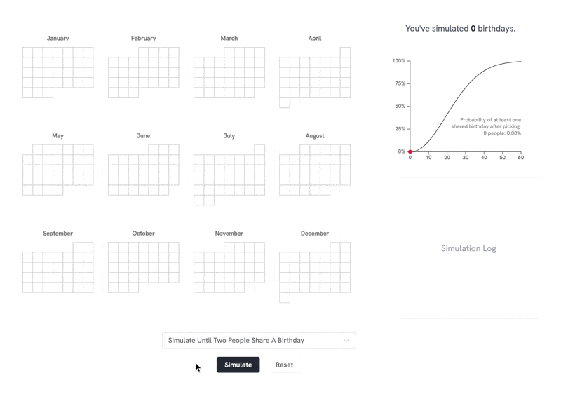
"Live link: https://perthirtysix.com/tool/birthday-paradox I built a sandbox that lets you simulate and understand the birthday paradox and few related problems. The birthday paradox tells us that in a room of 23 people, there are 50/50 odds that 2 people will have the same birthday (assuming a non-leap year and that birthdays are totally random, which they aren’t exactly). I’ve always found these types of problems really interesting and counterintuitive. The “aha” moment for me was realizing that _any_ two people sharing a birthday satisfies the problem, and at 23 people there are 253 different combinations of pairs between them. I hope you enjoy messing around with the tool! Built using Vue and p5.js, with probability formulas adapted from Wikipedia." Source: https://old.reddit.com/r/dataisbeautiful/comments/1f80chg/oc_i_built_an_interactive_simulation_of_the/

Source: https://old.reddit.com/r/dataisbeautiful/comments/1f5v84p/oc_something_silly_the_sbongebob_wiki_and/
Data source: [UN - World Population Prospects 2024](https://population.un.org/wpp/Download/Standard/CSV/) Tools used: Matplotlib The dataset offers multiple projections/simulations of population growth. In this chart, I'm using the most commonly used projection, which is called "Medium" in the data. Author: https://old.reddit.com/r/dataisbeautiful/comments/1f4smum/oc_chinas_age_distribution_from_1950_to_2100/

"I created this visualization to track Shohei Ohtani’s pursuit of a 50-50 season—achieving 50 home runs and 50 stolen bases in a single MLB season. Using data from ESPN, I simulated the remainder of his season to estimate the probabilities of reaching the "clubs": 30-30, 40-40, and 50-50. The 50-50 club refers to a player hitting 50 home runs and stealing 50 bases in a single season, which has never been accomplished in MLB history. It requires a rare combination of power and speed: the 40-40 club (40 HR, 40 SB) had been joined by only five players before this year. I built a simulation model to project Ohtani’s performance over the remaining games of the season. The model uses his current stats as a baseline and generates a range of possible outcomes based on typical variability in player performance. To stabilize the projection at the beginning of the season, I used a Bayesian prior based on his historical stats. As the season goes on, the prior is given less weight so that the current season's rates start to take over. Data Source: [ESPN](https://www.espn.com/mlb/player/_/id/39832/shohei-ohtani) Tools Used: Pandas, NumPy, Matplotlib" Source: https://old.reddit.com/r/dataisbeautiful/comments/1f4a1pc/oc_visualizing_shohei_ohtanis_chase_for_a_5050/

cross-posted from: https://sh.itjust.works/post/24428192 > Stolen from [Reddit](https://www.reddit.com/r/BSA/comments/1cngw3i/bsa_membership_graph_1911_2023/). > > The big drop in the 1970's was supposedly due to a change in the program to de-emphasize outdoor activities. The step down in 2019 was the LDS church cutting ties and starting their own program. > > If you consider this as a proportion of the population it's an even bigger drop. In 1970 there were about 4.8M scouts in a population of 205M, so about 2.3% of all Americans were in Boy Scouts. Now it's 1M scouts in a population of 341M, so only 0.3% of Americans are in Boy Scouts.

Interactive version: https://public.tableau.com/app/profile/bo.mccready8742/viz/TheBestTVShowFinalesDataPlusTV/BestTVShowFinales Source: https://reddit.com/comments/1f42jj3 Feel free to have a look at [!showsandmovies@lemm.ee](https://lemm.ee/c/showsandmovies) for a shows oriented community

cross-posted from: https://feddit.org/post/2312726 > We need taxes for all - also the super-rich. > > "Tax the rich" is an official EU petition. > The EU Parliament has to deal with it when successful. > > 7 EU countries must reach the quorum > Check yours in the chart and share! > > The petition calls for the introduction of a wealth tax on very large fortunes. > [Sign now](https://eci.ec.europa.eu/038/public/#/screen/home)

By [BoMcCready](https://www.reddit.com/r/dataisbeautiful/comments/1f2fm7n/the_worst_tv_show_finales_oc/) on Reddit's DataIsBeautiful


Do these "cost per click" figures actually represent the money Google receives (received) from these companies for every time someone ends up on their platform through the intermediation of Google?

 pudding.cool
 news.gallup.com

cross-posted from: https://lemmy.wtf/post/10032006

Source: https://www.pewresearch.org/short-reads/2024/08/15/a-growing-share-of-us-husbands-and-wives-are-roughly-the-same-age/

For some years now, I have seen this graph go around on social media. I think it's a powerful image, because it shows us so clearly that it is happening in our lifetime and under our watch. But when I use it in my work, I always add the disclaimer the the graph does not show when it was made. Because that is a problem: the graph might show us that if you are currently 30 years old, 50% of all the CO2 that has been emitted since 1751 has been emitted in your lifetime. But that percentage changes over time. By now, for people who are currently 30, the percentage will be higher, simply because the annual emissions have gone up since the graph was made. So I made a new version of the graph, the interactive version of which you can find here: http://mishathings.org:8050/ 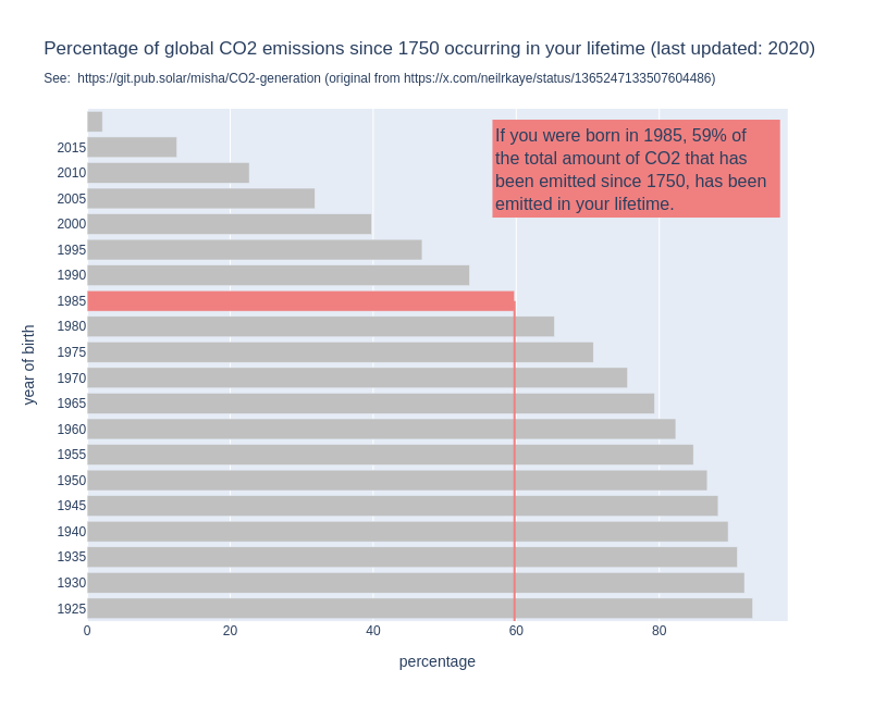 I wrote a post about this: https://mishathings.org/2024-08-12-how-much-co2-has-been-emitted-in-my-lifetime.html

cross-posted from: https://sh.itjust.works/post/23703271 > Source: https://twitter.com/mediazona_en/status/1823670620065808557

Data source: https://www.espn.com/mens-olympics-basketball/playbyplay/_/gameId/401694866

https://journals.sagepub.com/doi/10.1177/0308518X221098741#:~:text=The%20average%20return%2Don%2Dinves Los Angeles was able to have a surplus as most of the infrastructure was already built before the Games.


Source: https://www.kaggle.com/datasets/piterfm/paris-2024-olympic-summer-games

Small promo for [!football@lemmy.world](https://lemmy.world/c/football) > https://public.tableau.com/app/profile/bb.throwaway/viz/Normalizedfootballdata/Instrumentpanel1 > Normalized Football Data: "Normalized Football Data" is my platform for delivering advanced player rankings through a detailed analysis of performance metrics from the top seven European leagues over the past seven seasons (6 for Eredivisie and Primeira Liga/Portugal). My aim is to provide a fair and comprehensive comparison of players, regardless of league, team, or season. > How It (basically) Works: > Data Collection: I gather data from fbref.com, focusing on players who have played at least 33% of available minutes each season. This ensures the analysis reflects consistent and impactful contributions. Calculations were made in Excel and visual animations were made in Tableau Public. Normalization Process: Minutes Played: Statistics are adjusted on a per-minute basis for a more accurate comparison. My experience is that the accuracy of the scoring system increases when metrics are normalized around players with more minutes played. You can currently choose between three different minute-requirements (1/3, 1/2 or 2/3). League Elo Rating: I use a custom Elo rating to factor in the strength of each league. Essentially it means that if a player in the PL scores 1.0 goals per 90, a player from Eredivisie has to score 1.3 goals per 90 to achieve the same score. Success Rate Adjustment: Metrics like dribbles and tackles are adjusted for their success rates to better represent player effectiveness. On-Field Expected Goals Against (xGA): For defensive metrics, I normalize based on goals conceded and expected goals against (xGA) while the player is on the field, giving a clearer picture of defensive impact. This means that a player with 10 interceptions and 5 onga+onxga scores higher than a player with 40 inceptions and 30 onga+onxga. Metric Weighting: I assign different weights to each performance metric based on its importance: Non-Penalty Goals: Heavily weighted, up to 30 points. > Expected Goals (xG): Also highly valued, up to 20 points. > Assists, Key Passes, Progressive Carries, Defensive Actions etc.: These metrics are weighted at either 10 or 15 maximum points. Some minor ”discipline” metrics such as fouls commited (where low amounts of fouls give high score) are only ranked up to 5.0). > These points are arbitrarily chosen by me due to how I think they should be valued and from my experience with balancing the scoring system. I’m open to suggestions of you think any metric is wrongly valued. > Feature Scaling: I use the statistical method of feature scaling to standardize various metrics, allowing for a unified scoring system. Application Features: Filtering: You can dive deep into the data by filtering based on seasons, age, team, minutes played, nationality, league, role, and player names. This flexibility helps you focus on the specifics you’re interested in. Comparisons: Compare multiple players side-by-side and see how they measure up against each other. The platform makes it easy to visualize their stats and understand their relative strengths. > Current Scope and Future Plans: > Right now, the data includes only league play, but I want to expand this to cover cup competitions, more leagues, and detailed goalkeeper statistics in the future. > With "Normalized Football Data," I hope to help you uncover not just who the standout players are, but also what makes them excel.

**Tools:** * Microsoft Excel * Python * R * Adobe Illustrator **Sources (viewed online July 2024):** Artworks, lists and scripts available here: [paulgalea.com/Infographics/Colors\_across\_Great\_Artworks-Infographic\_Information.txt](http://paulgalea.com/Infographics/Colors_across_Great_Artworks-Infographic_Information.txt)


From the creator (not me) > !! ATTENTION !! Not all disciplines are shown, as only 5,148 out of 11,000+ athletes have their height information available on the official Olympics website. Hopefully, they will update the info eventually, as height plays a major role in disciplines such as rowing, weightlifting, and gymnastics. Data is from [Kaggle](https://www.kaggle.com/datasets/piterfm/paris-2024-olympic-summer-games), which seems webscraped from the official olympics website. Done in R, code can be found on my [github](https://github.com/PietroViolo/paris2024). The y axis has been sorted by MEDIAN height, men and women combined.


Source: https://en.wikipedia.org/wiki/2024_Summer_Olympics


Source: https://ourworldindata.org/how-do-the-risks-of-death-change-as-people-age Data: https://github.com/owid/notebooks/tree/main/SaloniDattani