SpreadSheetEnthusiasts
pancake
•
2 years ago
•
66%
Chart I made from countries' economic data (read description for info)
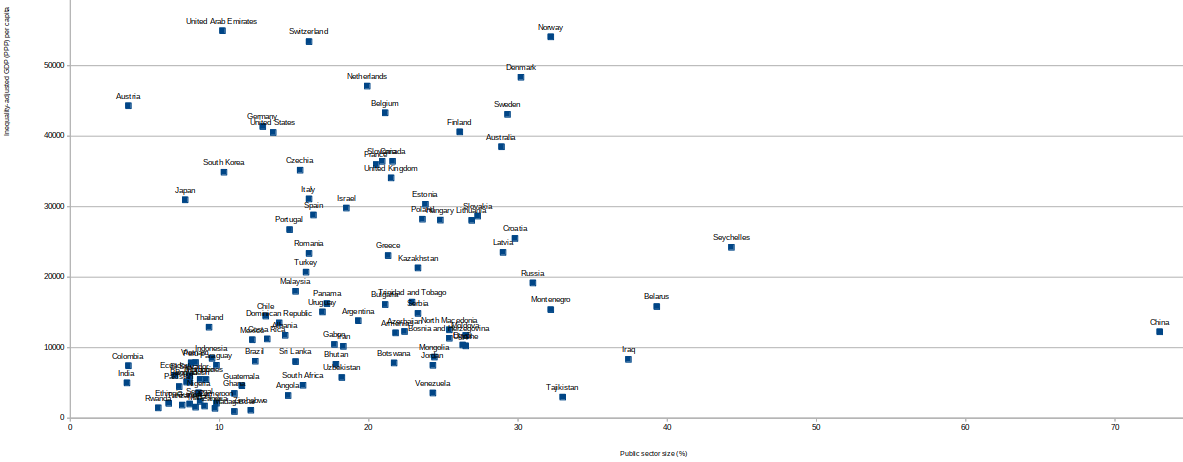
On the X axis is the relative size of the public sector in each country, as a percentage. On the Y axis, PPP-adjusted GDP per capita, also adjusted by a function I made that converts mean into median income given the Gini index. This function can be approximated as Value*(1 - Gini/0.9).
Comments 0