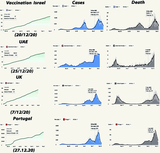
Picture of graphs I found on a website that has inconsistent scaling and lower death count.
I found this picture on here: https://www.thepeoplesvoice.org/TPV3/Voices.php/2021/02/28/hot-off-the-press-pfizer.
I get the feeling that whoever made this image didn't even read over the graphs. There's less deaths than cases in the picture. How does that make vaccines bad?
I can barely tell what these graphs are supposed to say, they are saved as a PNG and the text is so small.
Christ, this is pathetic. Anti-vaxxers are really desperate to find an excuse to be anti-vax.
Comments 0