Sidebar
Photo Critique
Welcome to the new photo critique community (magazine?)!! I am super excited to be a part of this new community here on Lemmy. A little background on me: I've been a hobby photographer for about a decade now and a professional real estate photographer and videographer for a couple of years. I am by no means an expert in any of this, but I do know the basics for sure! However, I really do think critiquing photos can be done by anyone from any background at any skill level! My goal with this community is to just recreate the photo critique community that I very much loved on Reddit. As such I think we should stick to the same rules that we used over there. Especially the rule regarding critiquing your own work first in >500 words. I believe this rule is key to helping photographers grow in their craft. You can't just expect people to help you without putting in a little effort helping yourself as well! I'll start by posting a few examples!

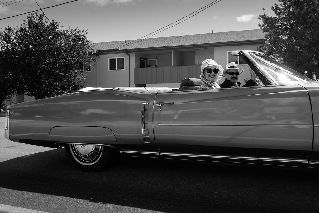
I am very happy with this shot. The lighting is very cool, I used a rather high ISO at 1600, but there is very little noise. It almost looks rendered in a 3D engine. Any ideas of possible improvements? Here's an alternative perspective (and shameless self promotion link): [https://lemmy.ml/post/5981879](https://lemmy.ml/post/5981879)


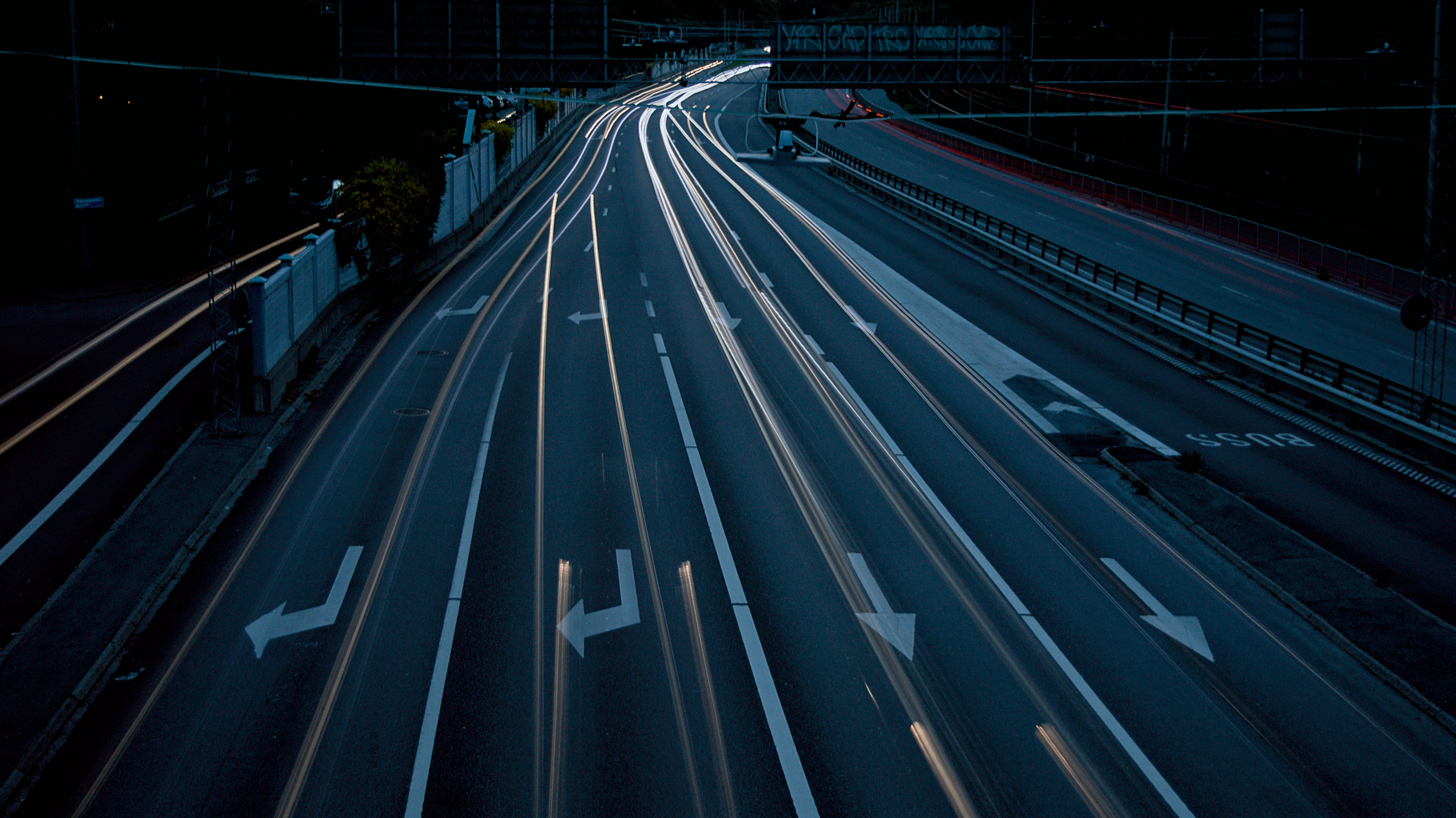
I wanted the road to not be as dark, but turning exposure up made the trails almost disappear in the fading contrast.

I feel like the shot is a little to dark on the right side and a little to bright on the left side. I'm not sure if I would be able to fix this in post in a good way without making it seem unnatural. Other than that maybe I applied a bit to much sharpening. The exposure was for 1.6s with my hands resting on the railing of the bridge I was standing on. So the sharpening helped disguise any blur from shooting handheld.

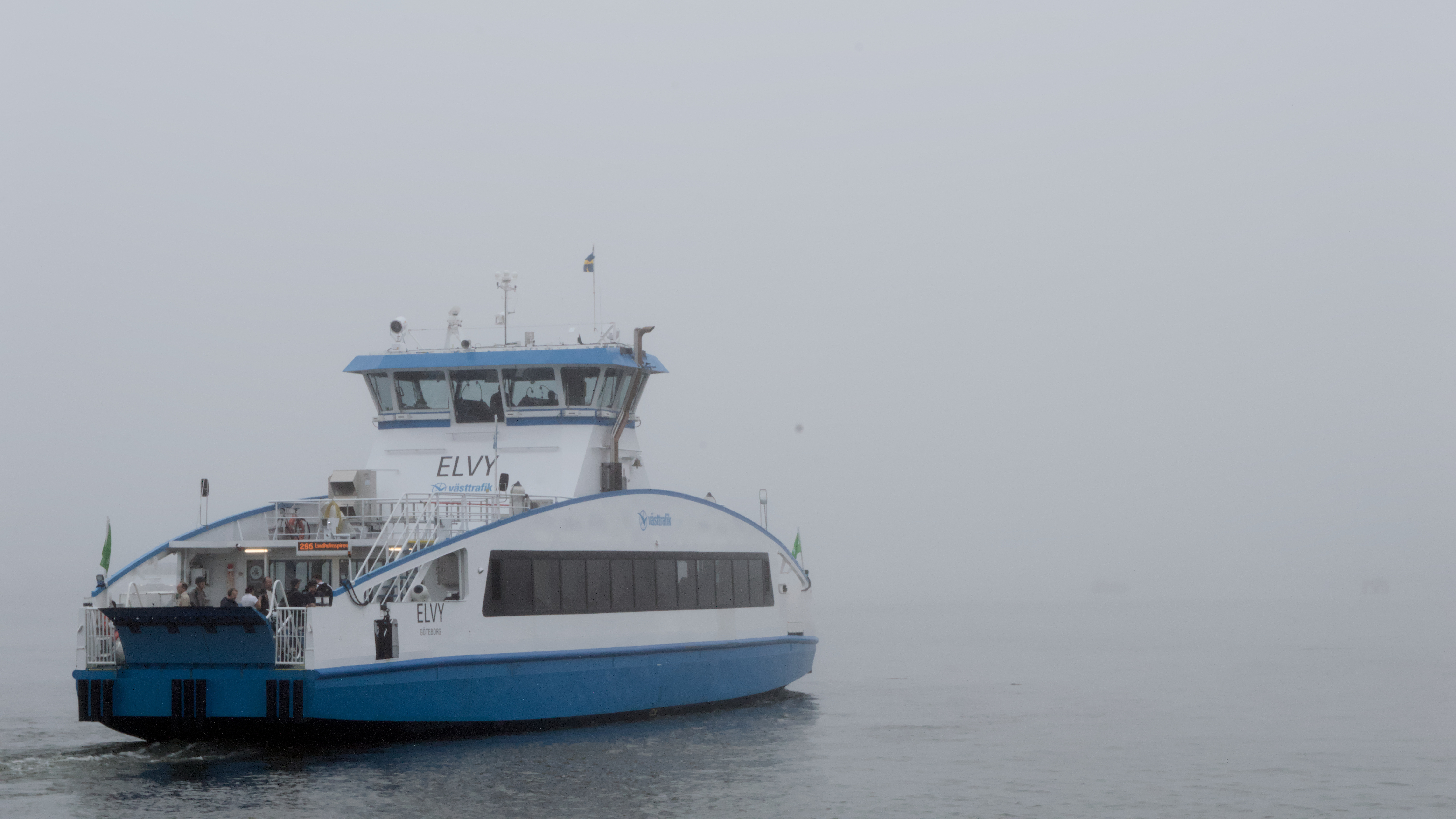
I can't really find anything I could have done to make this photo better. I'm not saying it is perfect. Just that I, as a complete amateur, can't come up with any improvement. I would like for the background to be darker, but shorter exposure would affect the boat as well which is not really okay. Any critique welcome!

Looking back, I wish I had taken some steps to the left so that I wouldn't have gotten the shady side of the house and also making the corner of the house straight relative to the framing. Right now I have rotated the framing in order to level the text properly. Any other advice is welcome!

This is the first photo I've taken where I preferred the monochrome filter over having the colours present. The sun being behind the building to the right (out of frame) makes the building seem darker and creates some glare that bleeds over the middle part of the photo. I've been thinking about whether or not this is a good thing, and I think I like it that way. Any critique is welcome!

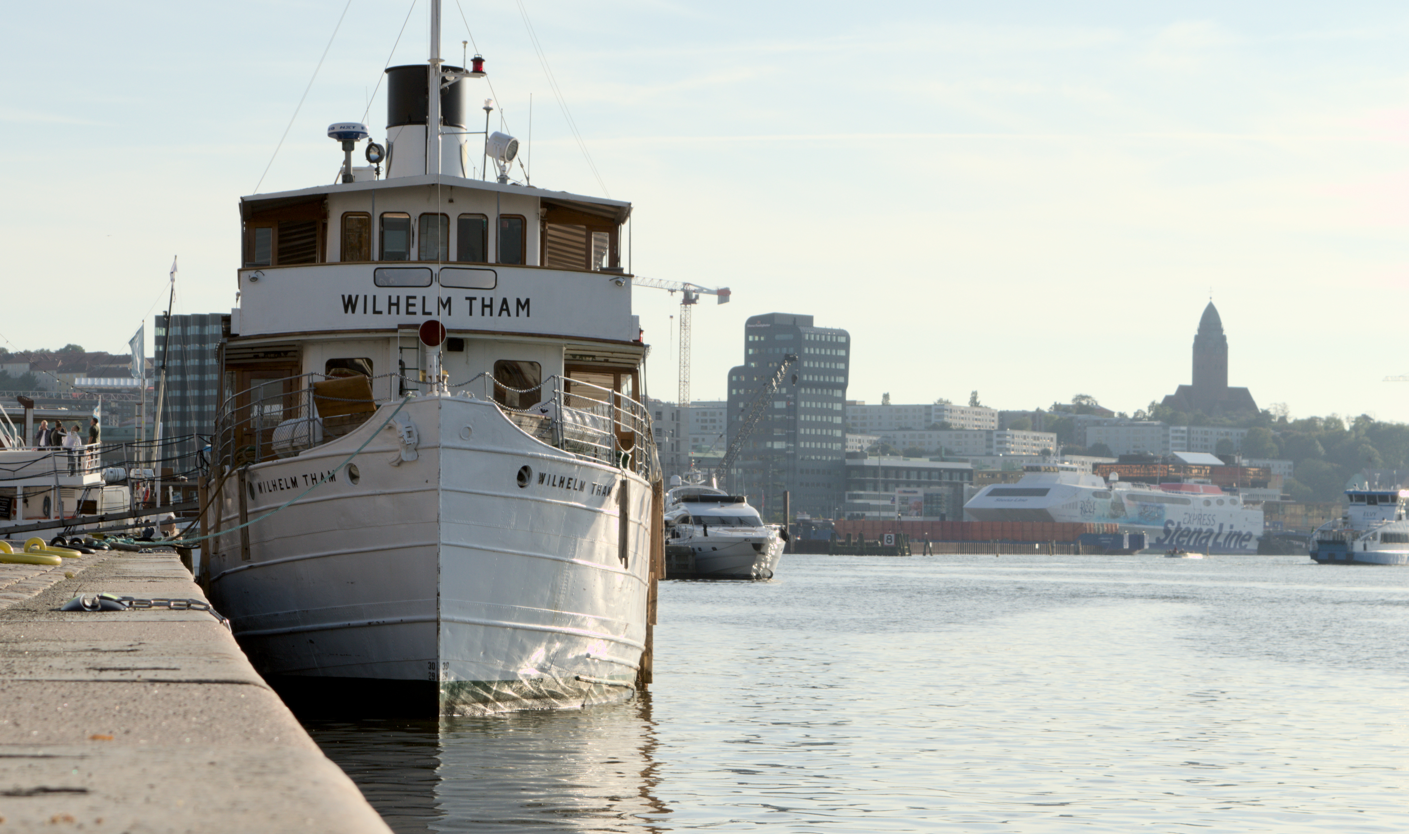
My only complaints are regarding the background. There is a yacht peeking out behind the subject boat and the ferry in the background is not very pretty. I wanted to be close to the edge so that I would include the water line of the boat in the photo. Otherwise I could have moved further to the left in order to hide the yacht thingy. I wish my lens would be able to open up wider (if I've understood aperture correctly..?) to create a blurrier background. Lowest I can do with my kit lens is 3.5f and that is if I don't use any zoom at all. Any other advice?

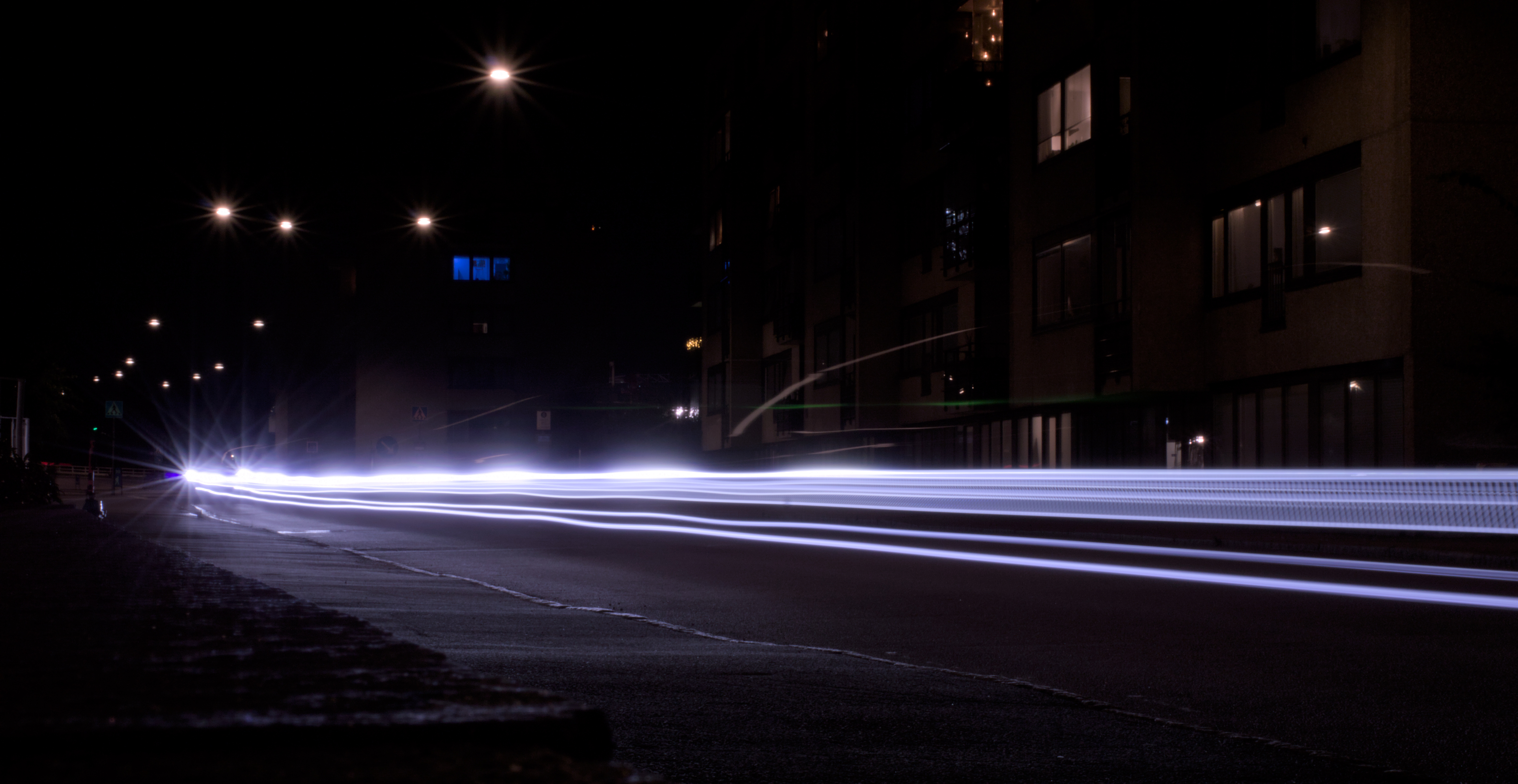
I have just started learning photography and took this yesterday. I am very happy with it. My own critique would be that I don't like the small light dashes that are over the middle of the "beams" and the "star effect" where the beams start out. I don't know where they come from. The star effect might come from the car going over a speed bump in the beginning, therefore being slower and emitting more light in one place, but I'm not really sure. Any critique is welcome! Come with suggestions what to do different or other stuff to try! I appreciate it :)

A doorway opens in the charred remains of home through which new worlds wait Canon EOS 5d mark ii Ef l100mm f/2.8L macro ISO 400 f/13 1/100

Taken with Nikon D90 and Tamron SP AF 28-75 f2.8 1/60s @ f11

I took this photo of my dog on a beach. It’s always been a favorites, but I feel like it’s audience might be limited because it isn’t a cute photo of a dog. I’d love to hear feedback. Just for kicks, here’s an alternative version of the crop. It tells a really different story: 

Hey all, found this one digging through some old photos and liked it a lot more than when I initially took it, I think it really does a good job of conveying the frantic energy of the metro. Not sure what direction I want to take it in the edit though, so I thought I'd ask for some advice!

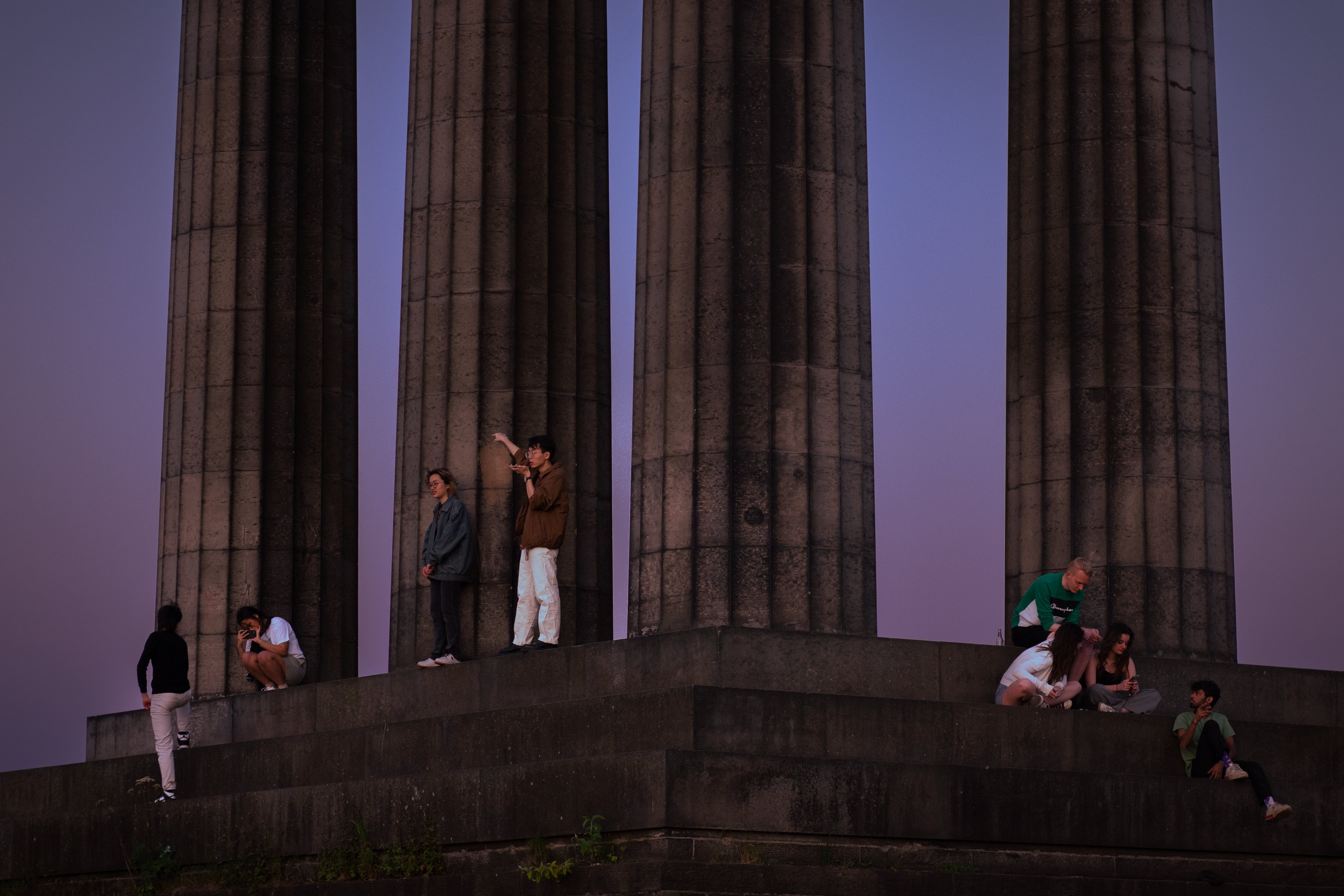
So I've been sitting on this one for a long time - it too comes from the January photos. I was inspired by another photographer who was posting abstract architectural photos on the reddit community and I wanted to try my hand at the style. I really like architectural photography, but it gets boring sometimes because it seems there's only a handful of good angles you can get of a particular building. So this kind of reinvigorated my creativity. To give some perspective, the roof line of the building is on the left. I've rotated the photo around and to me it looks like a closeup shot of a much taller building with the clouds behind. I really like that. The junction box sitting there is a little distracting to me but it isn't so bad & I'd rather not edit things out of the photo. Not only is it usually obvious to me where my own edit took place but it also goes along with my hang up about being disingenuous in my photography. I enjoy a lot of the texture here which was my main intrigue when snapping the photo. The wispy, smoke-like clouds remind me of the steam you see coming up from the streets sometimes. The weird metal facade over the concrete is just plain awesome to me - it looks soft and rigid at the same time. The concrete of the building has a nice smooth texture as well. I'm not sure what to think of the lighting. I think the gray sky behind the white clouds is a little too dark. The building itself looks pretty cool to me and I really like how dark the windows turned out. And the whole photo might adhere too much to the rule of thirds, it kind of gives me that too-clean feeling. Overall I think I did a pretty good job for a first go at this style!

I have no monies for any extra gear or lens adapters, but I have this 40 yr old macro lens (doesn’t mount to any of my film camera bodies) I had been using to magnify images onto the iphone 14 telephoto lens sensor and I finally purchased an actual digital camera (and apparently hands down the worst DSLR camera body Canon has ever dared to manufacture - the t100) which was cheap enough for me to melt a hole into the body cap until I could glue it as a mount to the macro lens so I could get a little more life out of this thing. Now, all things considered, how apparent is the Frankenstein lens and aps-c sensor configuration on a camera that is known to lack the same features that used models that have the exact same image sensor have??? Based on this image of course. I think she did pretty damn good

It's hard taking pictures in the dark. We went to see the Glowfari lanterns at the Oakland Zoo and this was my favorite photo. I like the composition with my daughter here looking at the clam shell but I always struggle with how dark is too dark and wonder if I should brighter up the subject a bit.
 flic.kr
Been taking photos for about a month now. I was really happy when I got this shot but I don't have the experience to know if its good or just ok. Would love some feedback.

I took this photo on a 2008 Fujifilm Z100fd so I don't really have much control over colors because it doesnt output RAW (i dont like how some parts of the shadows just fall into complete blackness) but im looking to see if this picture seems "interesting" to any of you

Hey all, I'm going back and forth on this one so I thought I'd ask for some feedback. I really like the moody atmosphere of this pic, but I'm worried that it's just too dark on most viewing devices except for a nice monitor or a good print. I can brighten the image, but there isn't much of visual interest in the darker areas, so I'm worried that it will be too boring of I do so. Thoughts?

Canon EOS 7D + EF24-70mm f/2.8L USM f/8.0 1/200s ISO100 24.00mm My first time flying in a hot air balloon! How'd I do?

Taken four years ago in Melbourne during the White Night Festival on my iPhone. The photo is cropped just a little at the bottom to keep a few additional buildings out. Then desaturated and cooled a little.

I'm not sure what to do with this photo. It's from a series that I did back in January where the goal was to take at least one photo per day all in B&W. It was just something fun to do that would rekindle some inspiration and help me in a time I was feeling very uninspired. I chose B&W to give myself less to think about when shooting. Too often with color photos I want to edit the colors to make them pop or look more like they did in my mind's eye when taking the photo. But with B&W that isn't so much of an issue for me because now the photo looks nothing like it did when I was shooting and can it kind of be it's own thing. I like that. It's challenging for me to edit any photo, and this one is no different. I like that without color you can pump the contrast and exposure and really darken the shadows and make it kind of how you want just in messing with the light sliders. I'm pretty happy with how the lighting turned out. I wanted it to be very contrasty much like tri-x but when I did that intentionally it felt kind of wrong so I backed out and went with this. Maybe because the image is too clean and most of the shots I've seen on tri-x are very rough, gritty, etc. As for the framing and whatnot, this photo is quite cropped. Originally I did not notice the man lying on the bench and was moreso just taking a shot of the tracks to pass the time waiting for the train. When I got back to view the photos I liked the way he was off to the side on the right of the frame but he wasn't the focus. So I cropped in maybe like 25% to get the frame we have here. I like the emptiness/loneliness of the photo, but I feel like it's a bit too empty and is missing something to tie it all together nicely. I would have liked it better if maybe there was a group of people waiting near the man but no one was paying him any attention, just like I didn't notice him at first. So, what are your thoughts on the edit? Should I go full crazy and blast the heck out of that contrast slider? Should I have cropped differently? I just feel like this could be a great photo and it's one I look at often. It just needs a little something more in my opinion. ISO 100 | 50mm | f8 | 1/100s
Here is a photo series I did during covid when all the restaurants and cafes were closed. I was trying to get a bit of a disconnected feeling but at the same time longing for that restaurant experience again. This is why I went with the shitty weather, looking in approach. Luckily we have all that back now. I never really did anything with the series. The ramen one is probably my favourite which was the one I shot first. Let me know what you thing of this as a series.
Looking to see what people’s thoughts are on HSL sliders/white balance. Just started getting into wildlife/birding. I’d like to keep my editing to competition standards, so keep it as true as I can with minimal editing, but how much HSL/WB is too much? Image I have linked is both raw out of camera and my edited version. No manipulation done outside of crop, HSL/WB exposure highlights shadows, the usual. But is that much warmth too much? It was taken 40ish minutes before sunset, so I tried to give it the dreamy sunset vibe, but maybe it’s overdone. I enjoy how the final edit turned out, but is it not “pure” enough for say photo competition standards? I’d like to stay on those standards as I keep getting into it and get pictures I’d like to submit at some point.

It’s been several decades since I’ve opened my photography up for critique. I was a photography major back in the day and gave it up as a professional track so i could feed and house myself. I now really only share my photos with three friends. But there isn’t much in the way of actionable feedback - I’d love to hear your thoughts. This photo was taken on a piece of white paper under a skylight on a cloudy day with my iPhone. I made a few small edits to bring the reds out (such a hard color to get right in digital photography).

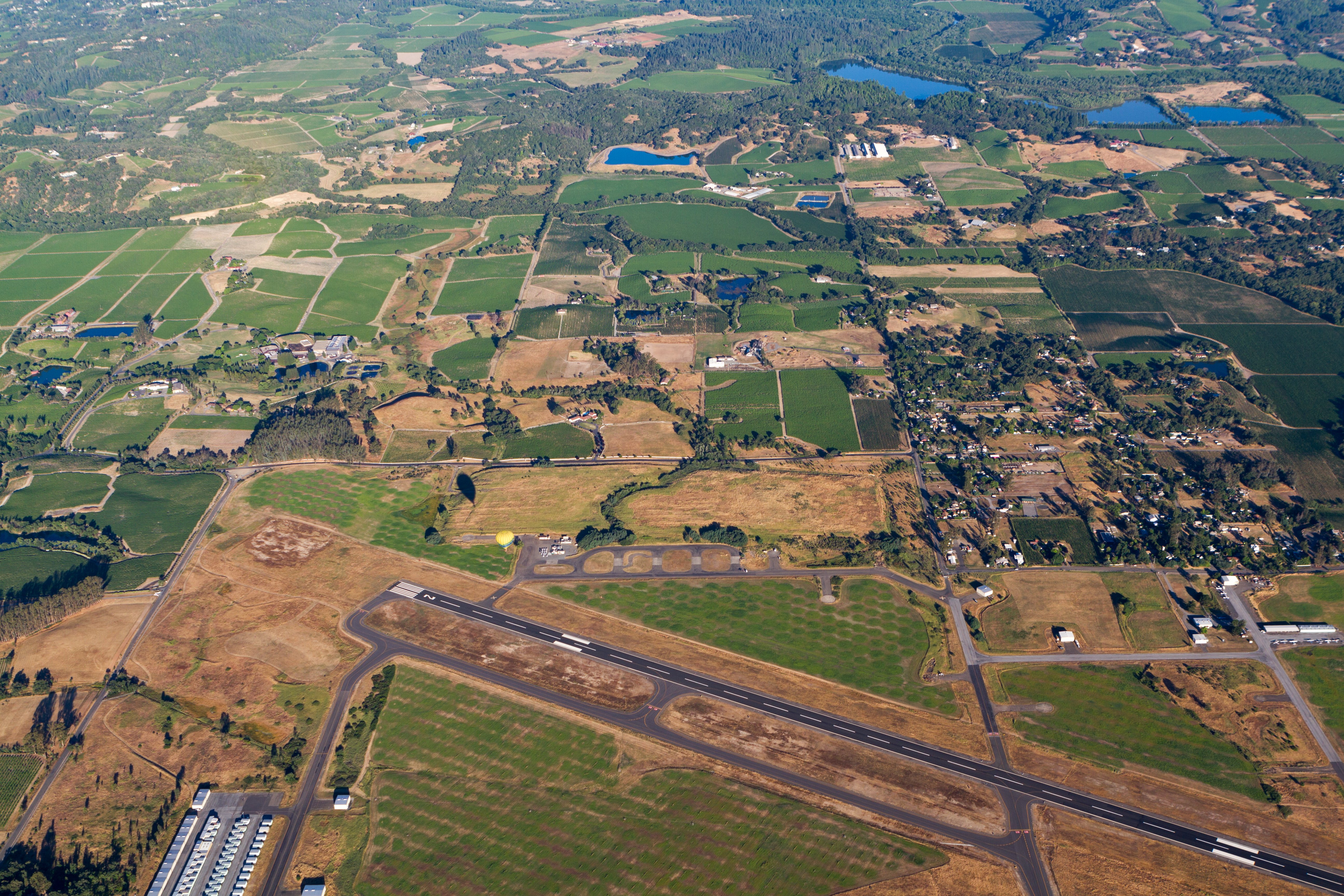
Hey all, looking for feedback on the edit here. Obviously lots of noise, not too much can do about that, but is the farm visible enough? Is there anything can do to make it pop more? Any and all feedback is appreciated!

Hey all, I'm a hobby photographer, took this one a couple days ago and can't seem to structure my own opinion about this snap. I'm trying to convey the feeling of experiencing a sunset, but I don't think sunset is very well expressed in this picture. I tried to boost the colors a little bit to help, would love some feedback on best practice for that. Also not sure if I've chosen the best crop, but that's somewhat secondary for me. Any and all feedback is welcome, I'm new to this whole Lemmy thing, here's hoping it goes well!

South India, viewpoint in the mountains near Yercaud. Used the auto-focus which adjusted on the bushes behind the monkey, leaving the monkey unfortunately out of focus. I like the atmosphere of this photo, although it took some exposure adjustments in the editor to get it this way. ::: spoiler spoiler The Macaque is facing towards the camera. ::: . Fujifilm X-T100, XC15-45mmF3.5-5.6 kit lens ISO 200, 1/150s,f/5.6

This is a photo I took recently enough. What I like about is how your eyes get drawn to the yellow taxi. Despite being quite a busy with all the lines and leaves there is a certain kind of calmness in the shot. What could make this shot better for me is if there was just a little bit more going on around the taxi maybe someone getting in or out. I'd be curious to here your thoughts. Camera: Minolta CLE Lens: M-Rokkor 40mm F2 Film: Fujifilm 400H
We need a logo for our community! I have 0 skill when it comes to logo design or anything like that pretty much. I asked ChatGPT to make one and it came up with a pretty good sounding design with some pretty thoughtful elements > >The logo features a camera lens as the central element. The lens is depicted >in a simplified and geometric style, with clean lines and rounded edges. It >symbolizes photography and serves as a visual representation of the >community's focus on critiquing photos. > >Surrounding the lens, there are three speech bubbles, each representing >conversation, feedback, and critique. The speech bubbles indicate the >interactive and collaborative nature of the community, emphasizing the >importance of communication and discussions around photography. > >The color scheme of the logo is a combination of vibrant blue and crisp white. >Blue represents trust, reliability, and professionalism, while white adds a >sense of purity and clarity. The contrast between the two colors enhances the >visual appeal and legibility of the logo. I think that's a pretty good starting point but I'm down for whatever! I think it just looks weird with no logo! Any other ideas are TOTALLY welcome!

Part of me absolutely loves this picture, but part of me thinks maybe I should've done something differently. I'm interested to hear others thoughts. **Things I like:** - I really like the contrast between the dark water and the brightness of the cliffside. - I also like the way the wake behind the boat appears **Things that could be improved:** - Would it be better if the boat was on the right side of the frame? I feel like where it is right now cuts off some of the wake and detracts from the photo. - Also, while I like the division between light and dark, should it be framed higher so there is less of the water and more cliff? It just feels like a lot of the water is dead space to me.

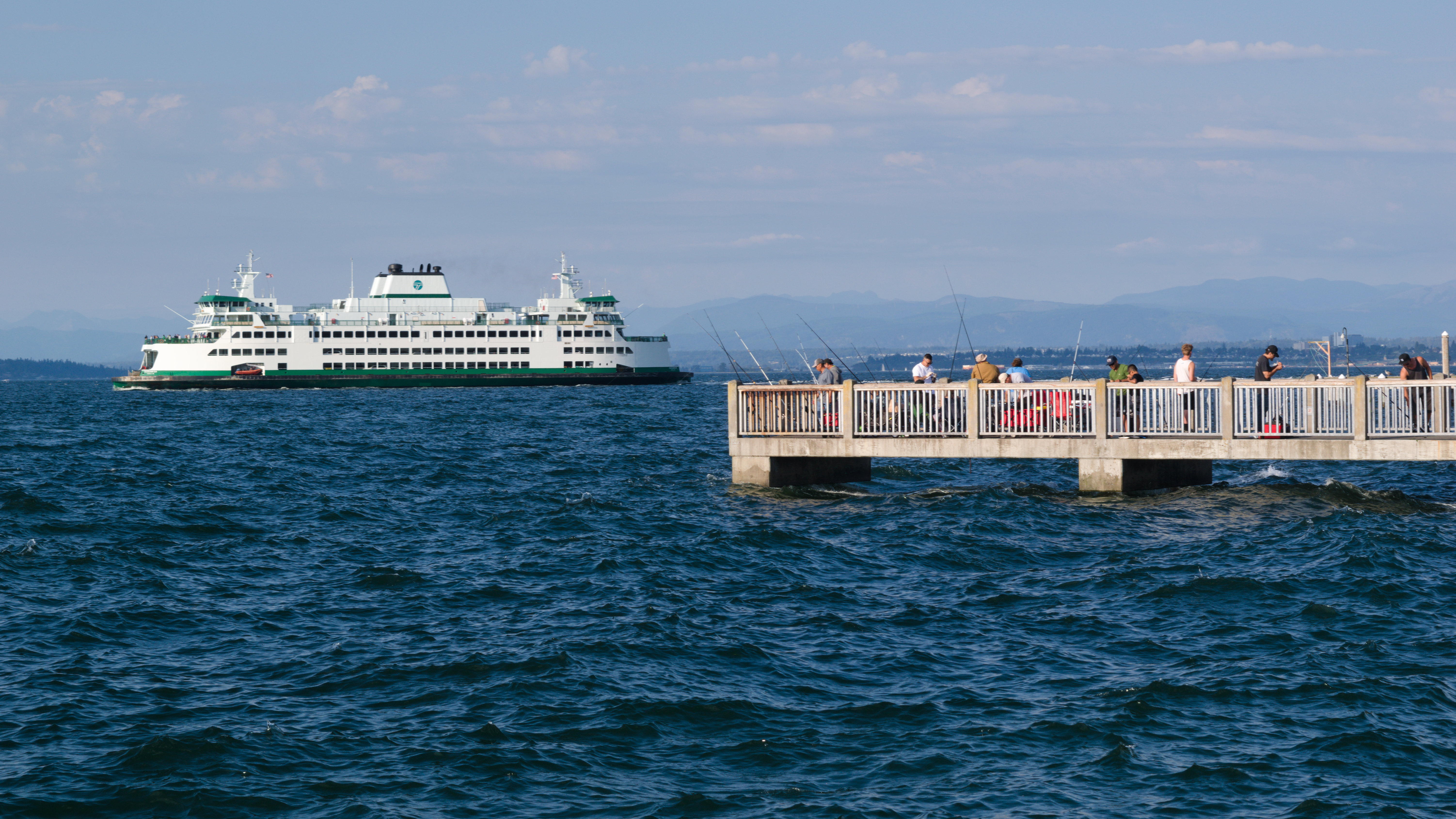
Shot at 55mm, f/10, 1/160th, ISO 100. Last summer, I went over to Lighthouse Park with the intent of getting some shots of the ferry underway. I decided to include the pier, as it and the fishermen add a bit more life to the shot.


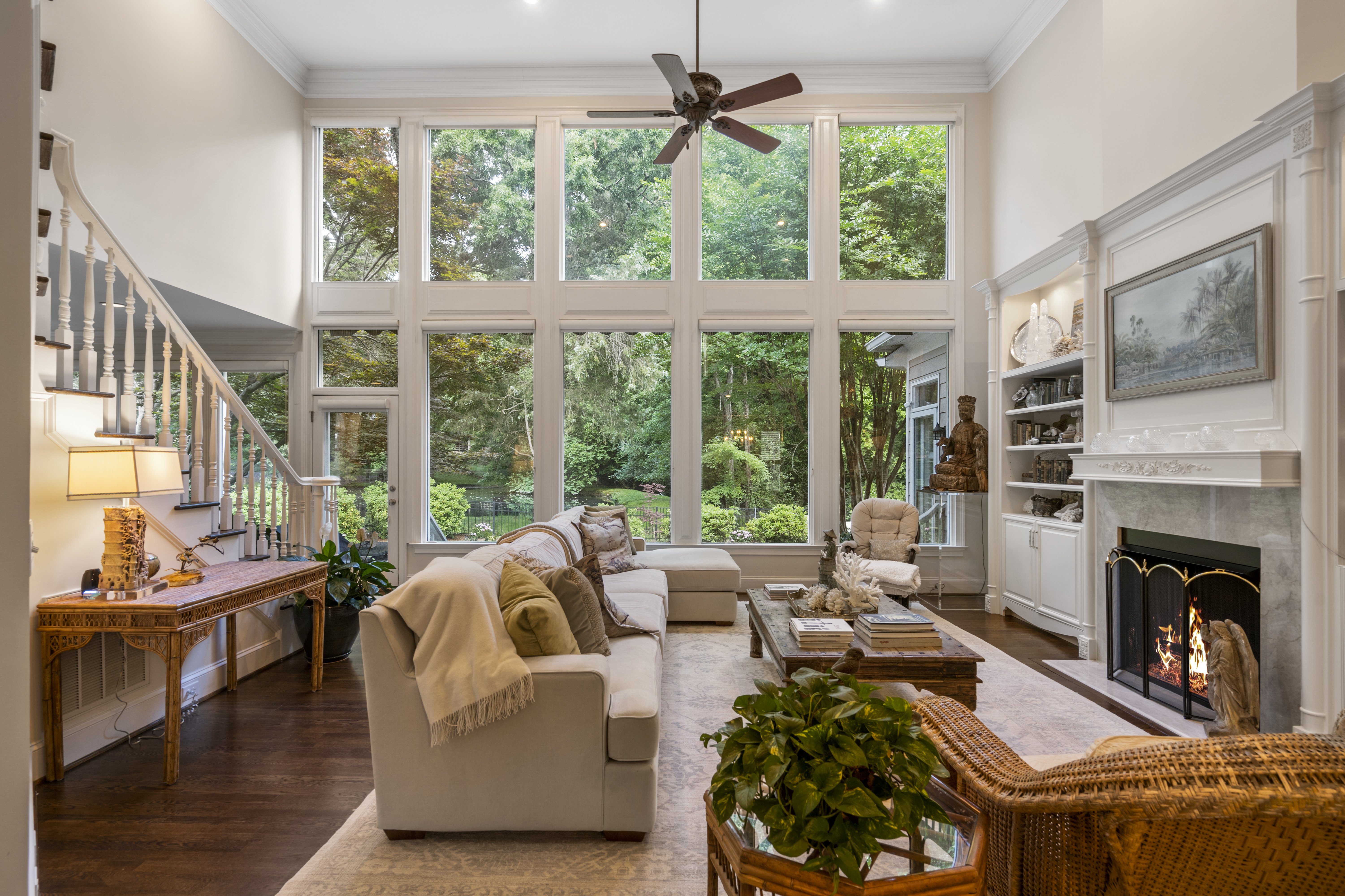
This one here is one of my all-time favorite interior photos. I absolutely love the gigantic windows and hate to think how expensive something like this would be. As for the photo, I like everything about it. The staging was fantastic and the colors and design of the space works so well. I feel like these interior type photos are hard to critique because I really didn't do much work to get this photo. Just tripod positioning and the thought process to decide this was a good angle to capture. I do think i should have raised the tripod. There may have been something preventing me from doing so. I know there was a catwalk style walkway overhead and maybe that ceiling line was butting into the frame when the tripod was higher...who knows! This photo was taken at least a year ago, but I think it's a great one to share!

This one right here is one of my most recent favorites. A couple weeks ago on Memorial Day weekend it rained the entire few days. So what better way to make the most of the rain than taking photos! I went to a local college that has a few very old, historic buildings ( a favorite subject of mine) that I'd been considering photographing for quite a while. And it was finally the time. I set out with my rain jacket on, boots laced tight, and a grocery bag wrapped around my camera and lens to hopefully protect everything. I used a 1/8 promist filter stacked on top of a 1/4PM because I'm on a budget and can't afford a more dense mist filter just yet. These are also 72mm filters on a 48mm lens which just looked hilarious, but as you can see the results are pretty good! Things I like: everything? but more seriously, my favorite part of the image has to be the red streak of brake lights directly over the bench on the right side of the frame. I wanted to show the bench in the photo but not bring too much attention to it and I think the red streak guides the eye over there and makes you wonder just a bit. The glow and color of the lights inside the building are also just wonderful to me. I love some good lights! And the color of them was perfect for the atmosphere I was going after. Things I don't like: I think the area in the middle of the frame is kind of uninteresting and needs a subject like someone strolling through with an umbrella and maybe walking a dog...that sort of thing. In order to mitigate this I tried using a wide ratio for the crop and I really think it works. The crop kind of makes two photos that are tied together by an uninteresting middle part that your eyes walk back and forth between to get to the more interesting parts of the image. Anyways give me some feedback! What do you like? What do you not like? Do you hate it? All thoughts are welcome! :)

This one is a bit of a weird one for me. I don't usually photograph vehicles but this one really stood out to me mainly because of the license plate but it's also just a beautiful bike! Anyways I really like how the light is shining off of different parts on the motorcycle especially the bright highlight on the gas tank and the tops of the engine. I also like the gradient on the rear tire. And I think the depth of field blur of the background is also sufficient and not too much bokeh and not too sharp - I think it looks very natural. Things I don't like: I think the background is too busy with the SUV and the work truck back there. If I were to take the shot again, I'd wait for the traffic to clear for sure. The owner of the motorcycle had seen me out there taking photos by this point and was talking my ear off about different aspects of it which did distract me from the photo and might have led to this mistake. I love meeting new people when doing street photography though!

This was my first time photographing live music! I took a ton of photos that evening and this is, by far, one of my favorites. I really enjoy the purple tones of the lighting on the backdrop. I feel like purple is a pretty uncommon color overall and I think it really makes this image pop. I like the concentrated look on the player's face like he is really focusing on nailing all the notes. I believe they were playing Gold on the Ceiling. Another aspect of this photo that I like is the angle of the bass itself because it accentuates the depth with the leading lines of the strings and the neck of the bass. It feels like it's coming out towards the viewer. Some things I don't like: I feel like the background is too busy. I tried to fix a few things in Lightroom and even removed the text on the big banner behind the player, but I still feel like it's too busy. I feel like the microphone could be removed from the image. And I would do that, but I don't like spending hours on making the removal look as perfect as possible and instead will just try to mitigate those distraction in the future when shooting other performers. There is a pole directly behind the cord to the bass that jumps out to me and looks like crappy masking or some sort of retouching, like the cord is glowing a bit because of that. Personally, this is really distracting to me and may warrant a crop to remove that altogether. Looking forward to your thoughts!