Sidebar
Open Source Fonts
https://typotheque.luuse.fun/ https://www.tunera.xyz/ https://deathoftypography.com/ https://www.theleagueofmoveabletype.com/ https://www.fontsinthewild.com/ https://www.design-research.be/by-womxn/ https://velvetyne.fr/ https://usemodify.com/ https://www.fontshare.com/ https://open-foundry.com/fonts https://uncut.wtf/ https://www.freefaces.gallery/ https://www.collletttivo.it/ https://deathoftypography.com/typefaces/
https://github.com/weiweihuanghuang/Work-Sans
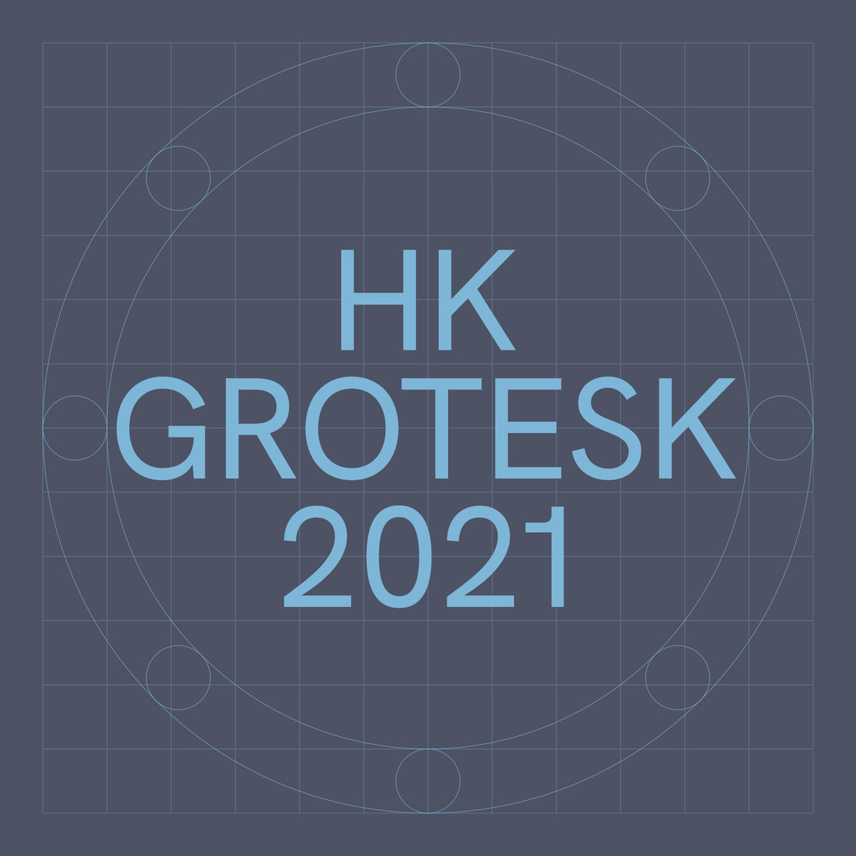 hanken.co
https://github.com/HankenDesignCo/HK-Grotesk
https://raphaelbastide.com/avara/ https://gitlab.com/velvetyne/Avara

 www.tunera.xyz
From the website... *Piscolabis is a bold and condensed display typeface based on various hand-painted signs found across Europe. The project started as a sans-serif spin-off of the [Picaflor](https://appliedmetaprojects.com/pages/2021picaflor.html) typeface (with which it shares the same x-height) but it soon developed its own personality.*
 brailleinstitute.org
Interesting!
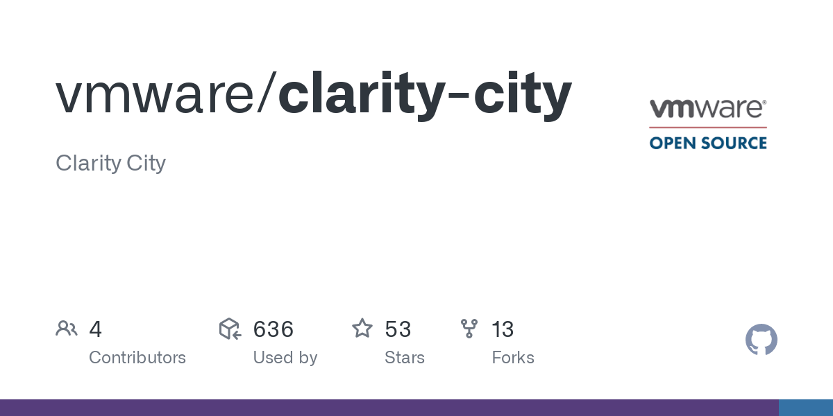 github.com
Clarity City is an open source sans-serif typeface. It is the default font for the VMware Clarity Design System. 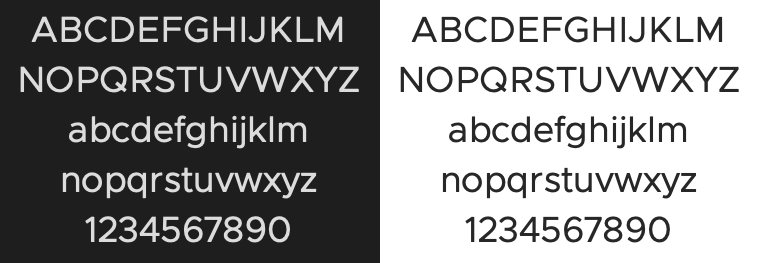
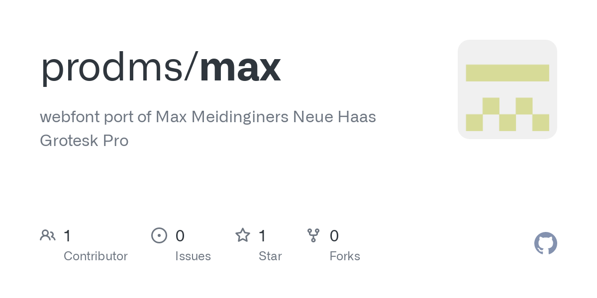 github.com
"webfont port of Max Meidinginers Neue Haas Grotesk Pro "
 Announcement: https://mastodon.art/@eishiya/108151431771594810
 www.lexend.com
In 1999, as an educational therapist, Dr. Bonnie Shaver-Troup, working with clients, began observing that reading issues masked the individual’s true capability and intelligence. In 2000, Bonnie theorized that reading performance would improve through use of: - A sans-serif font to reduce cognitive noise -Expanded scaling to improve potential for character recognition -Hyper-expansion of character spacing, which creates a greater lag time and reduces potential crowding and masking effects These changes led to the development of seven specially-designed fonts, which create an immediate improvement in reading performance. This is where Lexend was formed. [Github] https://github.com/googlefonts/lexend [Website] https://www.lexend.com/
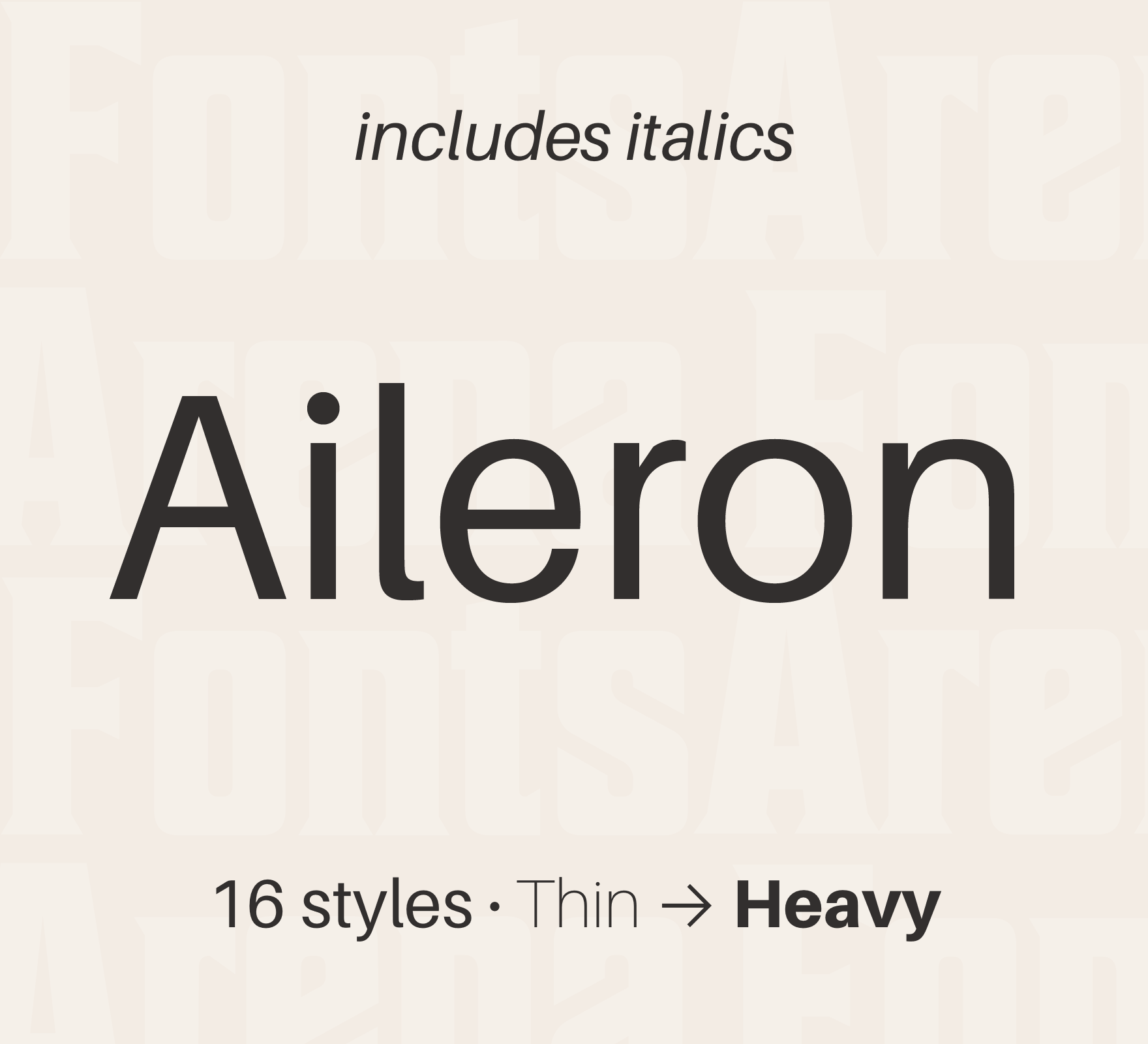 fontsarena.com
Aileron by Sora Sagano "Aileron is a Neo-Grotesque sans serif super-family of fonts inspired by Helvetica. Compared to Helvetica, it has legibility improvements like curved lowercase l to be easily distinguishable from uppercase I. Dots and periods are circular and follow Euler spiral, giving a soft appearance. While from a design point of view Aileron is close to Helvetica, conceptually it is closer to Univers."
Chivo (‘goat’ in Spanish) is the first Omnibus-Type neo-grotesque typeface family. It has 7 weight variants, plus matching italics. Its solidness and balanced strokes give Chivo both elegance and practicality. Chivo Regular works perfectly in long-reading texts, while Chivo Black is ideal for headlines, banners and highlights. Developed by Héctor Gatti, this is an indispensable ally for any designer.
 github.com
Very nice serif typography, the only problem at the moment is that it doesn't exist in italic... I hope it will come soon.
A good free alternative to Trajan. It has no lowercase, but can be used for titling for example. https://fontlibrary.org/en/font/cinzel https://github.com/NDISCOVER/Cinzel
 github.com
The SORA typeface was designed to capture SORAMITSU's spirit and heritage and is highly optimized for user interfaces. The outcome is a type family with cues of low-resolution aesthetics and early screen typography but without nostalgia, as every decision was considered towards the crisp digital environment of today. The particularly big x-height combined with evidently generous counters turns the family into a convenient tool for app and web interfaces, where clarity and effectiveness at any size is an imperative. Therefore giving us a neutral, yet distinctive, sans serif typeface with excellent legibility across various mediums. The SORA typeface is an open-source project and available for download and use following the Open Font License (OFL).
Nimbus Sans L is a version of Nimbus Sans using Adobe font sources. It was designed in 1987. The family includes 17 fonts in 5 weights and 2 widths, with Nimbus Sans L Extra Black only available in condensed roman format. A subset of Nimbus Sans L, which includes regular and bold weight fonts in all widths and styles, were released under the GPL and AFPL in Type 1 format in 1996 and LPPL in 2009, and is one of several freely licensed fonts offered by URW++. Although the characters are not exactly the same, Nimbus Sans L has metrics almost identical to Helvetica and Arial. Nimbus Sans L is one of the Ghostscript fonts, a set of free alternatives to the 35 basic PostScript fonts (which include Helvetica). It is a standard typeface in many GNU/Linux distributions. It was used as default font in OpenOffice.org Calc and Impress in some GNU/Linux distributions (e.g. Ubuntu - up to version 8.10; since Ubuntu 9.04 the default font was changed to Liberation Sans).
The package contains the most recent version of the TeX Gyre Termes family of fonts in the PostScript Type 1 and OpenType formats. TeX Gyre Termes is based on the URW Nimbus Roman No9 L kindly released by URW++ Design and Development Inc. under GFL (independently of the GPL release accompanying Ghostscript). The Vietnamese glyphs were added by Han The Thanh. TeX Gyre Termes can be used as a replacement for the renowned Times (new) Roman font (designed by Stanley Morison together with Starling Burgess and Victor Lardent for the London newspaper “The Times”; it was first issued by the Monotype Corporation in 1932 -- see the article by Charles Bigelow for interesting details: http://www.truetype-typography.com/articles/times.htm).
The package contains the most recent version of the TeX Gyre Heros family of fonts in the PostScript Type 1 and OpenType formats. TeX Gyre Heros is based on the URW Nimbus Sans L kindly released by URW++ Design and Development Inc. under GFL (independently of the GPL release accompanying Ghostscript). The Vietnamese glyphs were added by Han The Thanh. TeX Gyre Heros can be used as a replacement for a popular font Helvetica, also known as Swiss (prepared by Max Miedinger with Eduard Hoffmann, 1957, at the Haas Type Foundry).
 github.com
Palanquin Fonts Palanquin is a Unicode-compliant Latin and Devanagari text type family designed for the digital age. The Devanagari is monolinear and was designed alongside the sans serif Latin. Palanquin Dark is the heavier display family, with 4 weights. Palanquin is a text family with seven text weights. The Palanquin superfamily is versatile and strikes a balance between typographic conventions and that bit of sparkle. Many thanks to Michael for all the technical assistance. Heartfelt thanks to Maggi for the sincere support. The Palanquin project is led by Pria Ravichandran, a type designer from India. To contribute, see github.com/VanillaandCream/Palanquin
 kampanjat.hs.fi
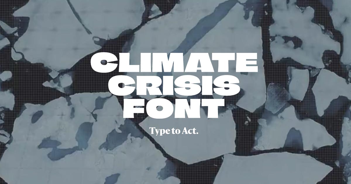
The font’s design is based on data from the National Snow and Ice Data Center (https://nsidc.org) and predictions provided by the IPCC (https://www.ipcc.ch/srocc/). The heaviest font weight represents the minimum extent of the Arctic sea ice in the year 1979, when satellite measuring began. The lightest weight represents IPCC’s 2050 forecast, when the Arctic sea ice minimum is expected to have shrunk to only 30 % of the 1979 extent.
 share.tube
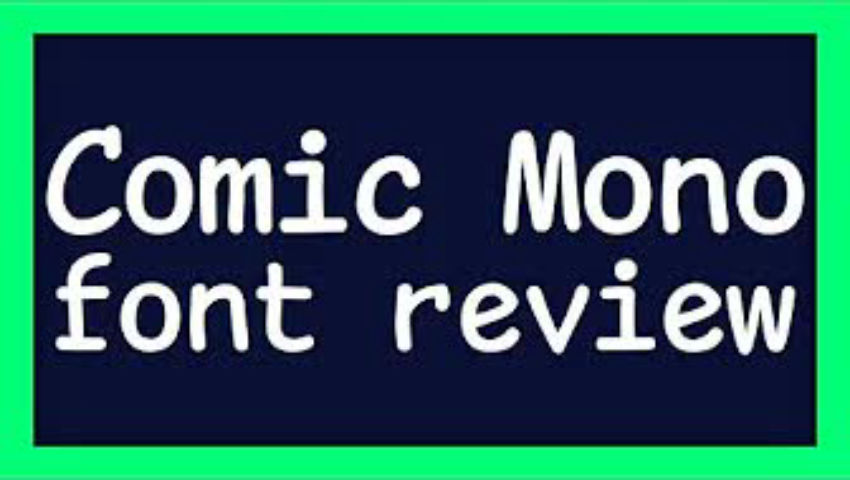
publicado de forma cruzada desde: https://lemmy.ml/post/68205 > Here is the source for the font: https://dtinth.github.io/comic-mono-font/
Paysage is a humanist-style sans-serif typeface created by Anton Moglia. It's characterised by a distinctive "g" and a regular rhythm. Paysage has been designed to give a feeling of simplicity and tranquility to the reader. Its design is adapted to the composition of short or long texts, legends or annotations.
Designed by Jean-Baptiste Morizot. Karrik is rooted in vernacular typography. The weight disadjustments, the lack of optical corrections, the uneven width of the letters are some of the features of early sans serif typefaces that inspired us in this boundless “reinterpretation.”
Iosevka is an open-source, sans-serif + slab-serif, monospace + quasi‑proportional typeface family, designed for writing code, using in terminals, and preparing technical documents.
 public-sans.digital.gov
"A strong, neutral typeface for interfaces, text, and headings." Public Sans is a fork of the SIL Open Licensed face Libre Franklin. Public Sans has many similarities with its parent, but differs enough in its particulars that its effect is distinct. Github: https://github.com/uswds/public-sans
 github.com
Libre Franklin is an interpretation and expancion based on the 1912 Morris Fuller Benton’s classic. Authors: Pablo Impallari, Rodrigo Fuenzalida and Nhung Nguyen
Luciole (French for “firefly”) is a new typeface developed explicitly for visually impaired people. The result of a two-year collaboration between the Centre Technique Régional pour la Déficience Visuelle (the Regional Technical Center for Visual Impairment) and the type-design studio typographies.fr, this project received a grant from the Swiss Ceres Foundation and support from the DIPHE laboratory at the Université Lumière Lyon 2.
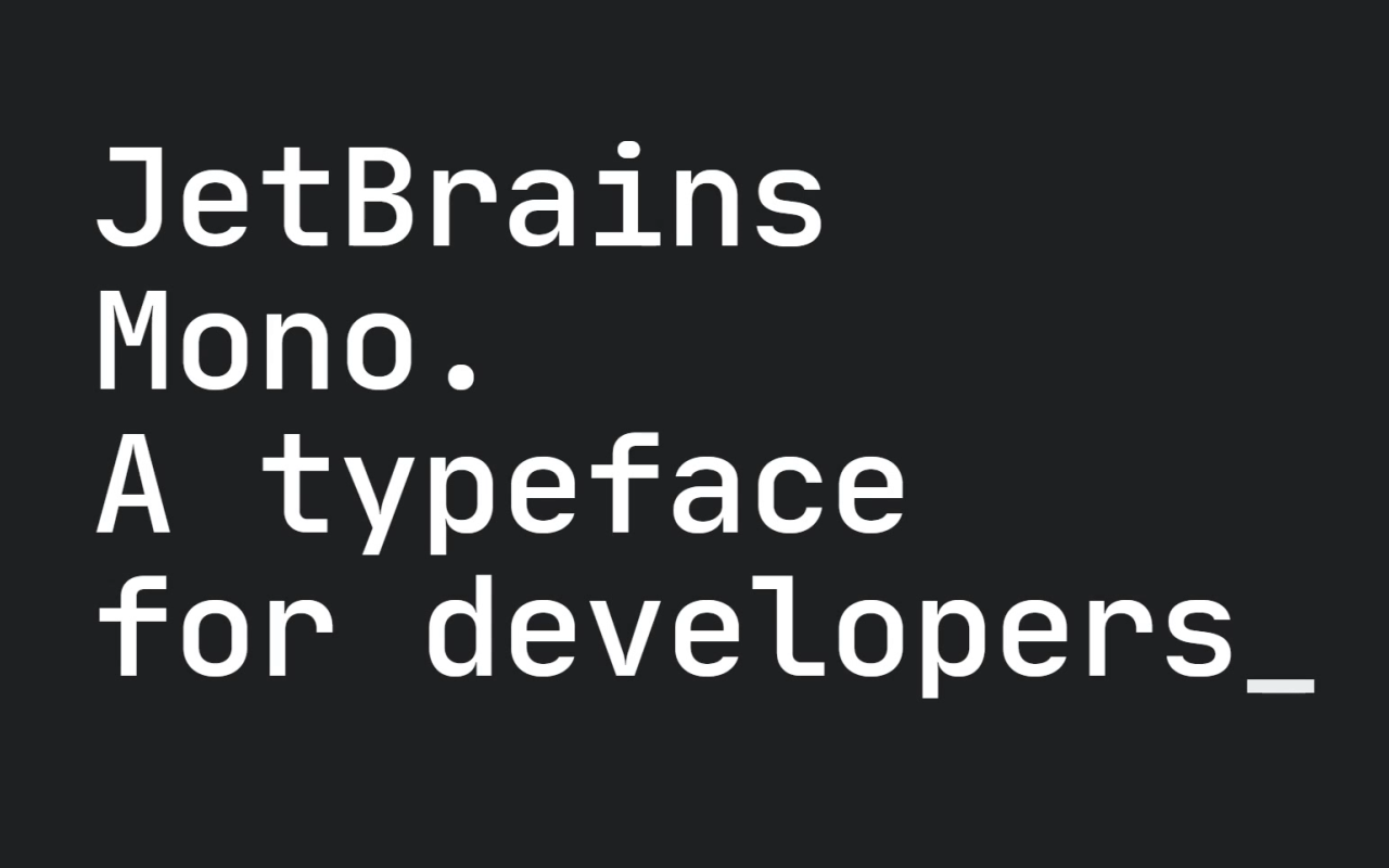 www.jetbrains.com
A typeface for developpers. Type designer: Philipp Nurullin
 github.com
Cormorant is an original design for an extravagant display serif typeface inspired by the Garamond heritage, hand-drawn and produced by Catharsis Fonts. While traditional Garamond cuts make for exquisite reading at book sizes, they appear clumpy and inelegant at larger sizes. The design goal of Cormorant was to distill the æsthetic essence of Garamond, unfetter it from the limitations of metal printing, and allow it to bloom into its natural refined form at high definition.
The design of Didot’s 1805 Greek typeface was influenced by the neoclassical ideals of the late 18th century. The font was brought to Greece at the time of the 1821 Greek Revolution, by Didot’s son, and was very widely used. The present version is provided by the Greek Font Society. The font supports the Greek alphabet, and is accompanied by a matching Latin alphabet based on Zapf’s Palatino. LaTeX support is provided, using the OT1, T1, TS1, and LGR encodings.
 github.com
EB Garamond is intended to be an excellent, classical, Garamond. It is a community project to create a revival of Claude Garamont’s famous humanist typefaces from the mid-16th century. This digital version reproduces the original design by Claude Garamont closely: The source for the letterforms is a scan of a specimen known as the “Berner specimen,” which was composed in 1592 by Conrad Berner, the son-in-law of Christian Egenolff and his successor at the Egenolff print office. This specimen shows Garamont’s roman and Granjon’s italic types at different sizes. Hence the name of this project: Egenolff-Berner Garamond.
What’s New? This is Bodoni* 2.2 which now includes small caps and old style numbers 0123456789, among other general improvements. A Brief History Giambattista Bodoni is known for creating one of the first “modern serif” type-faces. Advances in printing technology during the late eighteenth century allowed Bodoni to design letterforms with higher contrast between thick and thin strokes, and crisp horizontal serifs. The result is a typeface that’s recognizably elegant, refined, and remains popular centuries after its creation. No Compromises To put it simply, I made this typeface the best it could possibly be. I built the font from the ground up, using the principles laid out by Bodoni himself in the Manuale Tipografico. I want Bodoni* to be the ultimate digital realization of his ideas, and I stopped at nothing to ensure this.
 fabiandesmet.com
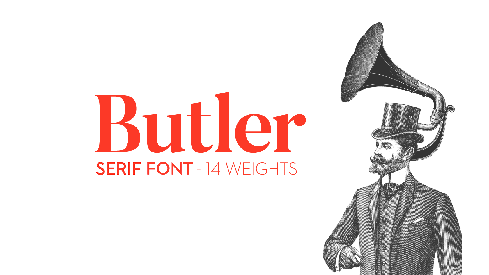
Butler is a free serif font inspired by a mix between both Dala Floda & the amazing Bodoni family. The main goal was to bring a bit of modernism to serif fonts by working on the curves of classical serif font families and adding an extra stencil family. Great for posters, very big titles, books & fancy stuff, the highly contrasted butler font is pleased to be at your service. The Butler family contains a total of 334 characters, 7 regular weights and 7 stencil weights, text figures, ligatures, fractions and a lot more. It also suits many languages with its added glyphs. • Free for both personal & commercial use!